

OVERVIEW
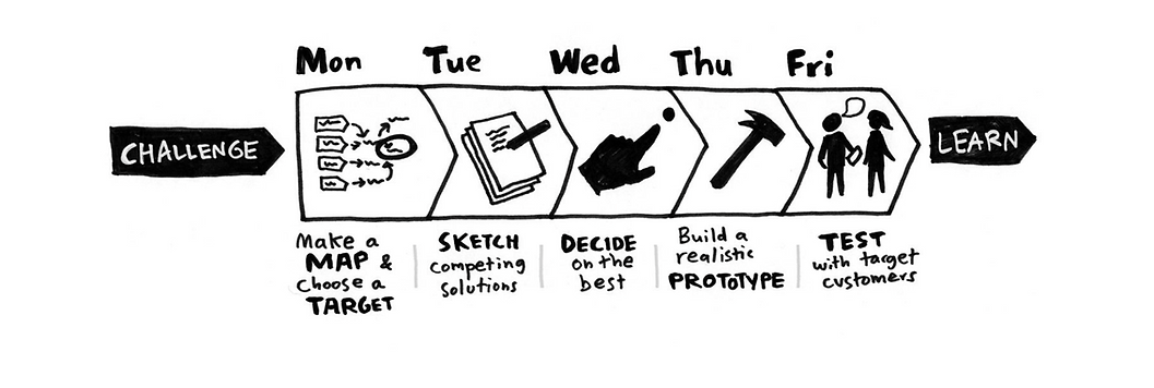
This project uses Google Ventures’ Design Sprint framework to quickly design and test a solution over 5 days.
CityPups is a startup that wants to help people living in cities find the perfect dog to adopt. Their platform aggregates adoptable dogs from local organizations and shelters, then sends users to a third-party contact to start the adoption process. Through previous research and interviews, CityPups has discovered that people living in cities struggle to find the perfect dog to adopt due to their unique needs. They need to consider their smaller living spaces, busy schedules, use of public transportation, availability of outdoor space, and other city-specific criteria. Is there a way to improve CityPups’ user experience to better cater to their users?
Client: Student Project at Springboard
Sector: Lifestyle - Dog Adoption
My Role: Solo design sprint - rapidly ideating, designing, prototyping, and testing a solution
Project time: 5 days
Tools Used: Figma
PROCESS
Problem
People in cities are struggling to find the perfect dog to adopt.
How might we help people in cities find the perfect dog that fits their unique lifestyle?
Constraints
-
The solution must be designed as a website (desktop & laptop screens).
-
CityPups aggregates adoption dogs from local organizations and shelters - the solution must be geared towards searching for dogs.
Preliminary Research Highlights
When looking for a dog to adopt online, users consider:
-
Presence of photos/videos
-
Dog size & space needs
-
Dog age
-
Good with dogs/other pets
-
Dog training level
-
Level of attention needed
-
Ease of finding information
User Persona
Meet Ellie, a 27-year-old living in NYC.
-
Ellie lives alone in a studio apartment.
-
She follows adoption agencies on Instagram and often “saves” dogs she’s interested in.
-
She has spoken to adoption agencies, but finding the right contact is difficult and time-consuming.
-
She asks her neighbors and friends in similar living situations for advice about owning a dog to ensure that she is making the right choice.

Goals:
-
To find a dog to adopt!
-
To feel confident that they will
be a great fit for each other, both emotionally and logistically.
Frustrations:
-
Ellie doesn’t feel 100% confident in finding a dog that is a good fit for her AND the dog.
-
Falling in love with a dog online, then later finding out that she can’t provide for its specific space and attention needs.
-
Confusing descriptions on adoption websites, i.e. “this dog doesn’t require a lot of space” — how small is too small?
DAY 1 - MAP
On the first day, I explored existing research to deeply empathize with Ellie’s goals and frustrations.
Then, I jumped right into imagining possible solutions by drawing a map of a possible end-to-end user experience. I envisioned Ellie finding her perfect dog by taking a quiz that focuses on understanding her unique urban lifestyle and ideal dog qualities.

DAY 2 - SKETCH
Lightning Demos
Before I began sketching, I spent some time looking at CityPups competitors and products with related features to gain some inspiration. I focused my research on PetFinder.com, LinkedIn.com, and Zillow.com, because (whether pet-related or not) all of these platforms contain personalized search and recommendation features.

Crazy 8’s SketchingI identified the most critical screen in a dog-adoption-search process as the one that displays dog results that fit a user’s preferences. To get my creative juices flowing, I did a “Crazy 8’s” exercise to sketch 8 different versions of this screen in 8 minutes, then picked the best one:

Solution Sketching
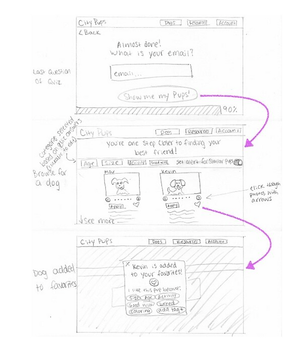
Once I identified the best screen from my Crazy 8’s, I created a solution sketch to get a fuller picture of my design solution. This sketch shows the last question in the quiz (where the user clicks “Show me my pups!”), the search results page, then a pop-up window where a user favorites a dog and indicates why they did so to organize their favorites.
DAY 3 - DECIDE
As a design sprint team of one, I spent day three deciding on my final solution and creating a storyboard to map out the full user journey of this experience.
Final solution: a quiz that asks users questions about their specific lifestyle and ideal dog
Because my target user, Elle, wants to find a dog and feel confident that it will be a great fit for her, I decided to design a quiz flow that seeks to understand users’ specific lifestyle and ideal dog. Then, they are only shown dogs that fit their specifications to ensure that they will find their perfect CityPup (and not become disappointed by seeing dogs that don’t fit their lifestyle). I created a story board to illustrate the entire journey a user might take in this situation:


DAY 4 - PROTOTYPE
Given that the goal of this sprint is to quickly prototype and test my quiz solution, this prototype is a lower fidelity and does not include full website functionality and graphics. Once a user takes the quiz and finds a dog that they like, they can add it to their favorites and further refine their list of potential dogs by adding tags to describe why they liked each dog.
DAY 5 - TEST
On the final day of the sprint, I recruited 5 usability testers via social media. All testers were in their late 20’s, have adopted or are currently looking to adopt a dog, and live in urban areas just like my user persona, Ellie.
Test Questions:
On the homepage, what is the first button you want to click?
Take the quiz — what do you think about all the questions?
Browse dog results and add one to your favorites — what do you expect to happen here?
How confident do you feel that this website will match you with a dog that is right for you (scale of 1-10)?
Key Findings:
All 5 users wanted to click the “Find your CityPup!” button first — this means that the quiz has a strong Call to Action.
4 out of 5 users wanted the small checkboxes by the “Next” button to be more visible, or part of the answer options.
3 out of 5 users made comments about verifying shelters and adoption security — they are concerned about visiting a reputable site.
3 out of 5 users said that they would probably not use the favorite tagging feature — they do not know enough about the feature and its functionality through this test.
Users were an average of 8.6/10 confident that they would be matched with the right dog for them.
CONCLUSION & NEXT STEPS
Given that users were an average of 8.6/10 confident that they would be matched with a dog that is right for them, I would consider this a successful design sprint. However, this experience was far from perfect and there are many things that I would change and build upon in the future.
Lessons Learned:
Doing a solo design sprint is tough! The most enlightening portion of this project was the user testing, and I found myself wishing I had a team to bounce ideas off of along the way. If given the chance to do this sprint again, I would be creative in sourcing collaborators and run group brainstorming sessions to create the best possible design sprint experience.
Empathy is everything — being able to fully immerse myself in Ellie’s shoes was essential to creating a viable solution, especially while working within the constraints of a sprint.
Rapid prototyping leads to rapid results — it is so important to get your product in front of users as soon as possible! I was so enlightened by my user testing sessions and wish I had the chance to iterate on my designs and test again with new users.
Things to Consider in the Future:
One user based their lower rating on the inability to filter for specific dog breeds — this could be added as a questioning the quiz and filter option on the results page.
Rethink the favorites tagging feature — is there a more intuitive way to help users organize the dogs they like?
Add an option for a nearby park in the living space question — this is a common city living attribute that was not accounted for.
Change the layout of the questions to make the small checkboxes next to the “Next” button more pronounced, or move the copy up into the answer options — most users did not enjoy the size and location of these boxes.
Add icons and testimonies to verify shelters and assure users that their adoption process is safe.
Use quiz answers to help users build an adoption “common app” that they can send to multiple shelters to save time (and shelters can have the option to add additional questions).
Include more clear information about breed temperament, health, and trainability in a dog’s profile.